Before You Build: Pick One Offer and One Angle
Do not start with design. Start with the offer, the audience, and the reason someone should care.
A good affiliate landing page usually answers four questions quickly:
- Who is this for?
- What problem does the product solve?
- Why should the reader trust your recommendation?
- What should they do next?
For example, instead of building a generic page for “email marketing software,” choose a tighter angle like “best email marketing tool for solo coaches who need simple automations.” That angle makes the headline, benefits, proof, and call to action much easier to write.
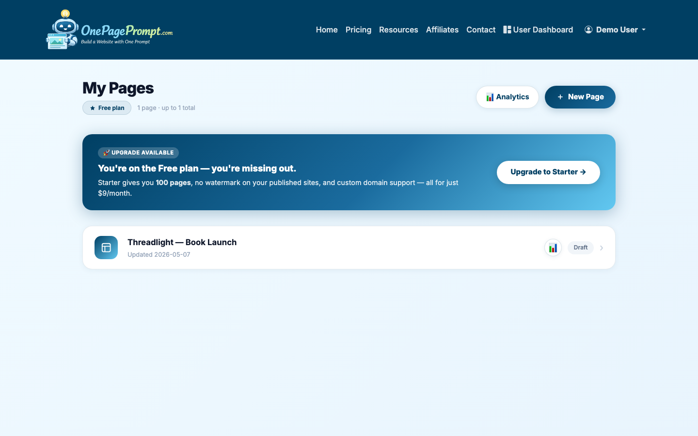
1. Start a New One-Page Project
From your OnePagePrompt dashboard, create a new project. Give the page a specific title, such as “Email Tool for Solo Coaches” or “My Recommended Bookkeeping App.”
Then open the new project form and describe the page in plain English. Include the product, audience, main benefits, required disclosure, and the call to action you want.
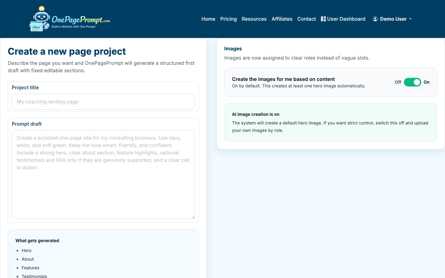
Here is a useful prompt structure:
- Product or offer: what you are promoting
- Audience: who the page is for
- Problem: what pain point the offer solves
- Proof: your experience, results, comparison, or reason for recommending it
- CTA: what the button should say
- Disclosure: a short affiliate relationship note
Example prompt:
“Create a one-page affiliate landing page recommending Acme Email for solo coaches. The page should explain that it helps coaches send newsletters, capture leads, and automate follow-ups without a complicated CRM. Include a clear affiliate disclosure near the top. Use a professional but friendly tone. Add sections for benefits, who it is best for, why I recommend it, FAQs, and a button that says Try Acme Email.”
2. Generate the Page
OnePagePrompt turns your description into a structured one-page website in under two minutes. The first draft should give you the page shape: hero, benefit sections, proof points, FAQs, and CTA areas.
Treat the generated page as a strong draft, not a final compliance review. Affiliate pages often need more specific proof and sharper positioning than a generic product page.
3. Edit the Hero for Clarity
Your hero section should make the recommendation obvious. Avoid vague headlines like “Grow Your Business Faster.” Use a concrete outcome tied to the affiliate product.
Better hero formulas include:
- “The email tool I recommend for solo coaches who want simple automations”
- “A beginner-friendly bookkeeping app for freelancers who hate spreadsheets”
- “My recommended landing page builder for authors launching a book bonus page”
Under the headline, write one or two sentences explaining the problem and why this product is a fit. Add the affiliate disclosure where visitors can see it before clicking.
A simple disclosure works:
“I may earn a commission if you buy through links on this page, at no extra cost to you.”
4. Add Proof Without Overclaiming
Affiliate pages lose trust when they sound like ads. Strong proof can be modest as long as it is specific.
Useful proof includes:
- Your own experience using the product
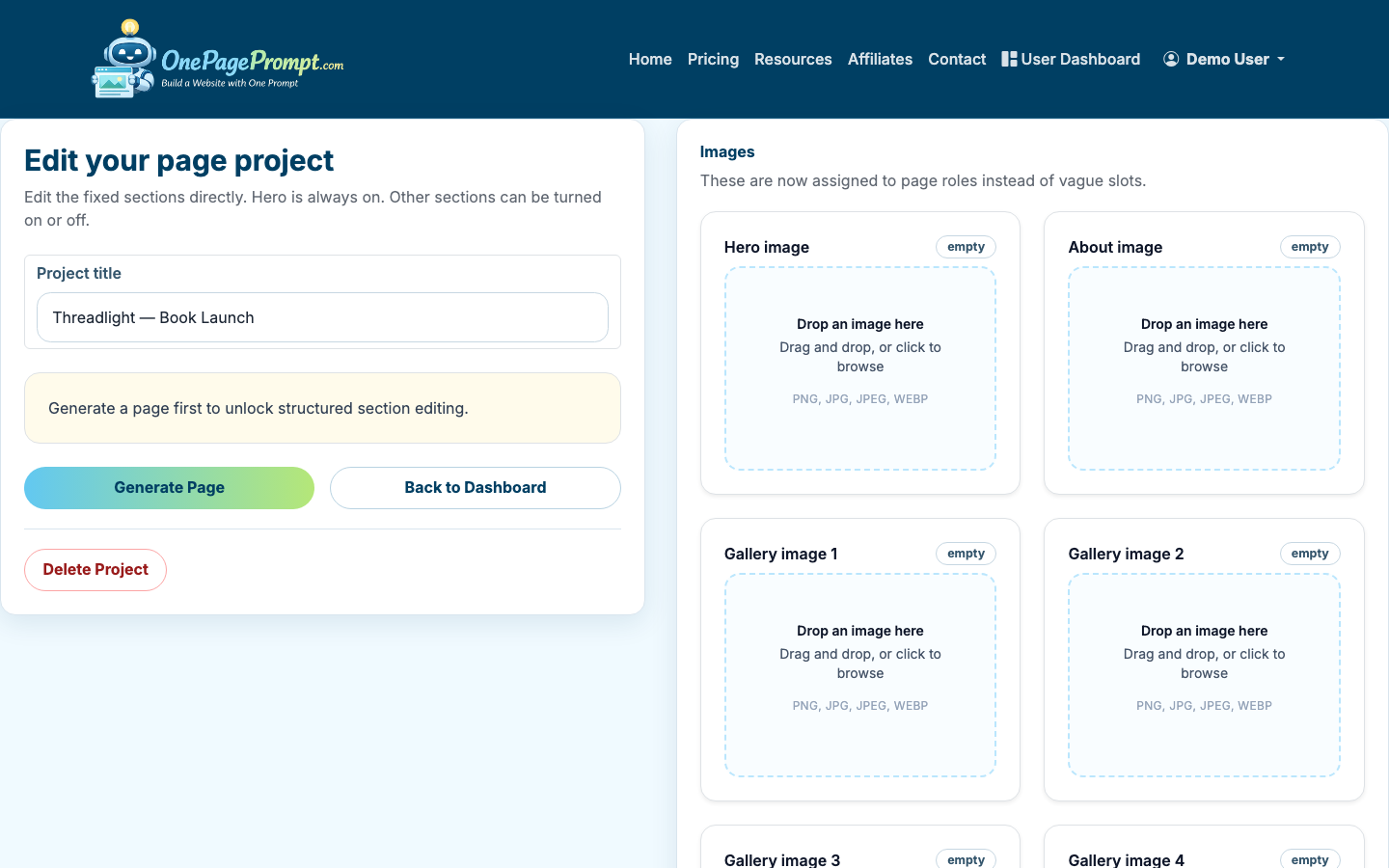
- Screenshots or images you are allowed to use
- A short comparison against the old way of doing the task
- Specific features that match the audience’s needs
- Honest limitations or who should not buy it
If you have images, upload them to the project before generation or add them while editing. OnePagePrompt supports up to 6 images per project, which is usually enough for a product screenshot, author photo, comparison graphic, or testimonial image.
5. Keep the Page Focused With Section Toggles
Affiliate landing pages do not need every possible section. In the project editor, use section on/off toggles to remove anything that distracts from the recommendation.
Most affiliate landing pages need:
- Hero with disclosure and CTA
- Benefits or use cases
- “Why I recommend it” section
- Who it is best for
- Honest limitations
- FAQ
- Final CTA
Sections you may not need:
- Long company history
- Generic feature grids
- Multiple competing offers
- Blog-style navigation
- Heavy image galleries
If you are comparing two or three affiliate products, that can work, but make the comparison table clear. If you are trying to promote ten offers on one page, consider a roundup article instead of a landing page.
6. Edit Colors and Calls to Action
Use the inline color editor to keep the page readable and consistent with the product category. For affiliate pages, clarity matters more than novelty. High-contrast buttons usually outperform subtle buttons because visitors can quickly see the next action.
CTA text should be specific, but not misleading. Good examples include:
- “Try Acme Email”
- “Check Current Pricing”
- “Start the Free Trial”
- “See Plans on Acme”
Avoid CTAs that imply the visitor is buying from you if they are being sent to the merchant. “Buy Now” may be accurate in some contexts, but “See Price” or “Visit Partner Site” is often clearer.
7. Preview the Page Before Publishing
Open the preview page and read the full landing page like a visitor would. Check the headline, disclosure, CTA buttons, mobile layout, and any product images.
Before publishing, confirm:
- The affiliate disclosure is visible before or near the first affiliate link
- Every CTA points to the correct destination
- The page has one primary action
- The copy names the audience clearly
- Claims are accurate and not exaggerated
- The page looks good on mobile
8. Publish and Share the Public URL
When the page is ready, use the public share URL. OnePagePrompt publishes pages at a URL like /p/<id>/<slug>, which is useful when you want to launch quickly without setting up DNS.
If you are testing how to create a landing page for affiliate marketing free, start with the free plan and a public share URL. That is enough for validating copy, sharing in a profile link, or testing traffic from a small audience.
For paid traffic, SEO campaigns, or a more branded affiliate site, a custom domain is usually better. Paid OnePagePrompt plans support CNAME-based custom domains, so you can point a domain or subdomain to your page after DNS verification.
Free vs. Paid: What Changes?
You can create a basic affiliate landing page for free with a hosted public URL. That is the lowest-friction way to test the offer and message.
A paid plan becomes more useful when you need:
- A custom domain for trust and brand consistency
- More serious paid traffic testing
- A cleaner URL for podcast, YouTube, or newsletter promotion
- A long-running page you plan to optimize over time
The tradeoff is simple: free is faster and lower risk; paid looks more professional and gives you more control.
If you are still learning landing page basics, start with How to Create a Landing Page. If budget is the main concern, read How to Create a Landing Page for Free. If your affiliate page also needs to collect leads before sending people to an offer, see How to Create a Lead Page.
Final Checklist
Before you send traffic to the page, review this checklist:
- The page promotes one offer or one clear comparison
- The audience is specific
- The affiliate disclosure is easy to notice
- Benefits are tied to real buyer problems
- Proof is honest and specific
- CTA buttons are clear and accurate
- The public page works on mobile
- Links include the correct affiliate tracking parameters
A good affiliate landing page does not need to be long. It needs to be specific, trustworthy, and easy to act on.