Before you build: define the offer
Before opening any page builder, write down four things:
- Who the offer is for
- What outcome they want
- What you are selling
- What action they should take next
For example: “This page sells a 4-week bookkeeping cleanup package for solo consultants who are behind on their finances. The goal is to book a consultation.”
That one sentence will make your page easier to build because every section has a job. If a section does not support trust, clarity, or action, it probably does not belong.
1. Start a new sales page project
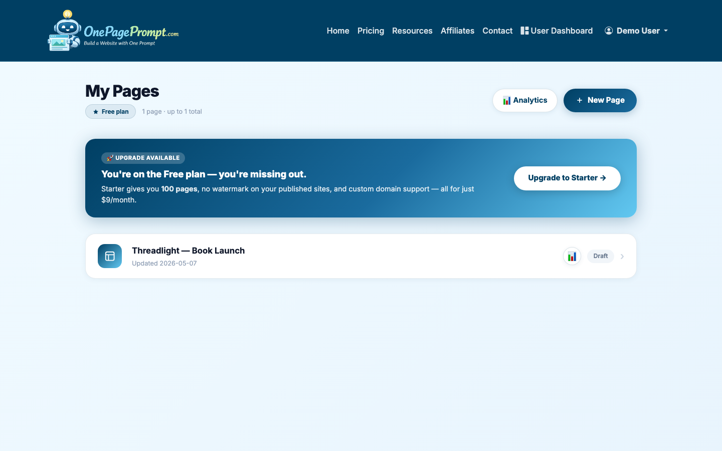
From your OnePagePrompt dashboard, create a new project. Give the project a practical title, such as “Bookkeeping Cleanup Sales Page” or “Author Coaching Sales Page.”
Then open the new project form and describe the sales page in plain English. Include the audience, offer, tone, call to action, and any sections you already know you want.
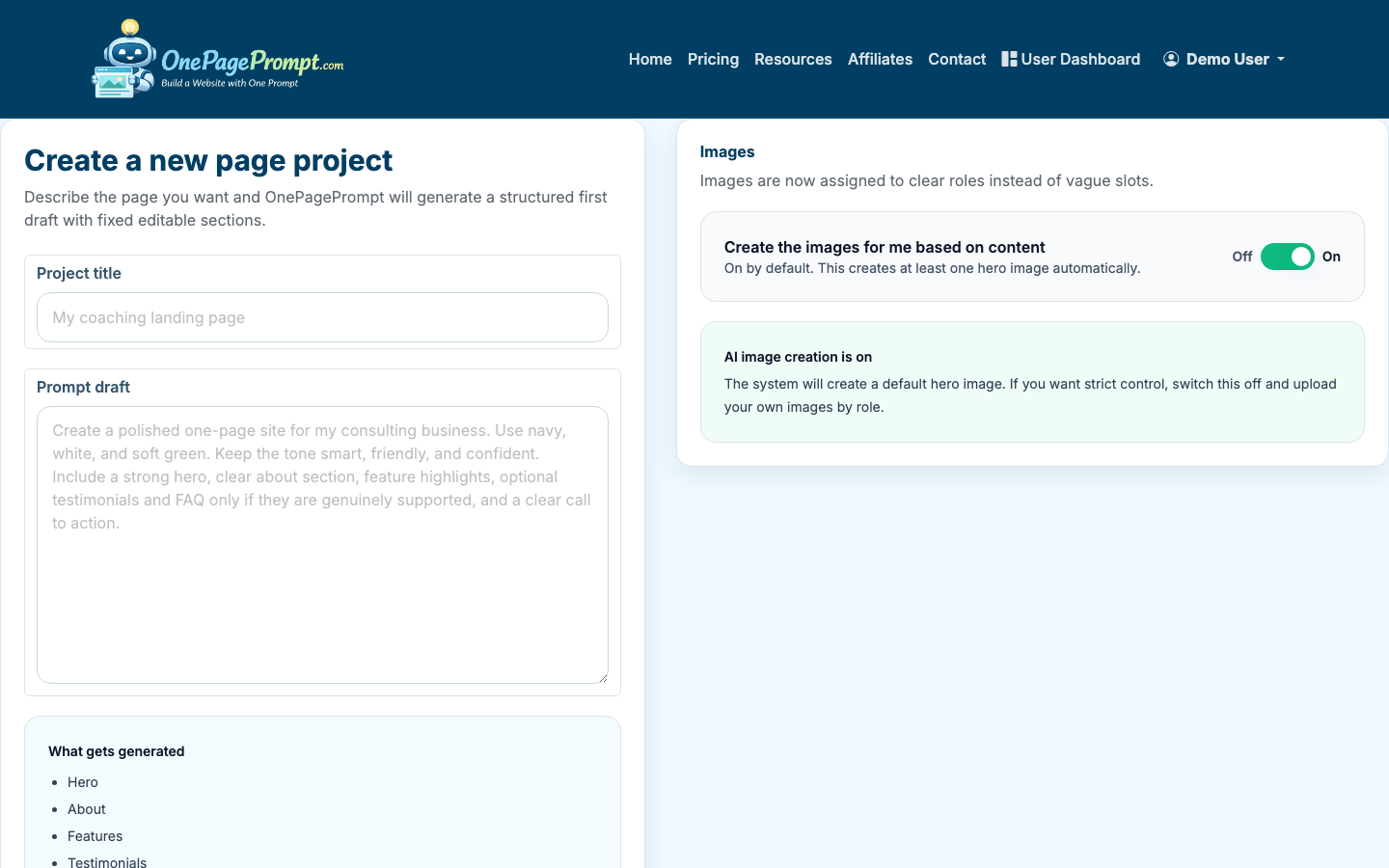
A strong prompt might look like this:
- “Create a sales page for a 6-week online course that helps first-time authors plan and launch their book. The audience is nonfiction authors who feel overwhelmed. Use a confident but warm tone. Include a hero section, benefits, curriculum overview, testimonials, pricing, FAQ, and a call to action to join the waitlist.”
If you have product photos, book covers, founder headshots, or examples of client results, upload them before generating. OnePagePrompt supports up to 6 images per project.
2. Generate the first draft
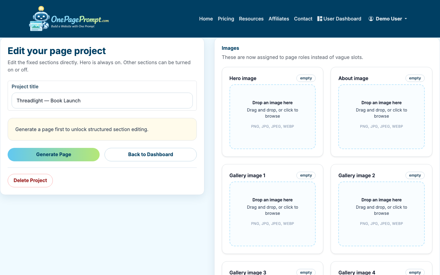
After you submit the prompt, OnePagePrompt creates a structured one-page website in under two minutes. Treat this first version as a strong draft, not the final page.
Your goal now is to tighten the message. Sales pages usually convert better when the promise is specific, the proof is concrete, and the call to action is repeated at natural decision points.
Review the generated sections and ask:
- Does the hero explain the offer within 5 seconds?
- Are the benefits written as outcomes, not features?
- Is there proof near the point where a visitor might hesitate?
- Is the CTA specific, such as “Book a call,” “Buy now,” or “Join the waitlist”?
3. Edit the hero section first
The hero section carries the most weight. It should answer three questions quickly:
- What is this?
- Who is it for?
- Why should I care?
A weak headline says: “Transform Your Business Today.”
A stronger headline says: “A 4-Week Bookkeeping Cleanup for Solo Consultants Who Need Their Numbers Fixed Before Tax Season.”
The second version is less flashy, but it is more useful. It names the offer, audience, and situation. That is what makes a sales page work.
In OnePagePrompt, edit the hero copy directly in the project editor. Keep the headline short enough to scan, then use the subheading to add context. If your CTA is a button, make the button label action-based.
Good CTA labels include:
- Book a consultation
- Start the course
- Get the template
- Join the waitlist
- Reserve your spot
4. Shape the page around buyer questions
When you build a sales page, the order of sections matters. You are not just listing information. You are guiding someone through a decision.
A reliable sales page structure is:
- Hero promise and CTA
- Problem or context
- Benefits and outcomes
- What is included
- Proof, testimonials, or examples
- Pricing or offer details
- FAQ and objection handling
- Final CTA
Use OnePagePrompt’s section toggles to turn off anything that distracts from the buying decision. For example, a general “About” section can help if the buyer needs to trust the founder. But if it repeats information already covered elsewhere, shorten it or remove it.
If you are still working on the broader funnel, you may also want to compare this with how to create a landing page. A sales page is usually more persuasion-heavy, while a general landing page may be built for signups, downloads, or traffic routing.
5. Add proof where the visitor hesitates
Proof works best when it appears near a claim. If you say your service saves time, show a testimonial about time saved. If you say the course is practical, show a curriculum preview or student result.
Useful proof includes:
- Testimonials with a name, role, or business type
- Before-and-after examples
- Screenshots of results, where appropriate
- Client logos, if you have permission
- Specific numbers, such as “37 students enrolled” or “12 client sites launched”
If you do not have testimonials yet, use credibility signals you can honestly support: your process, experience, examples, guarantees, or a clear explanation of what the buyer receives.
6. Preview the page before publishing
Once the page feels structurally complete, open the preview. Read it like a buyer, not like the person who wrote it.
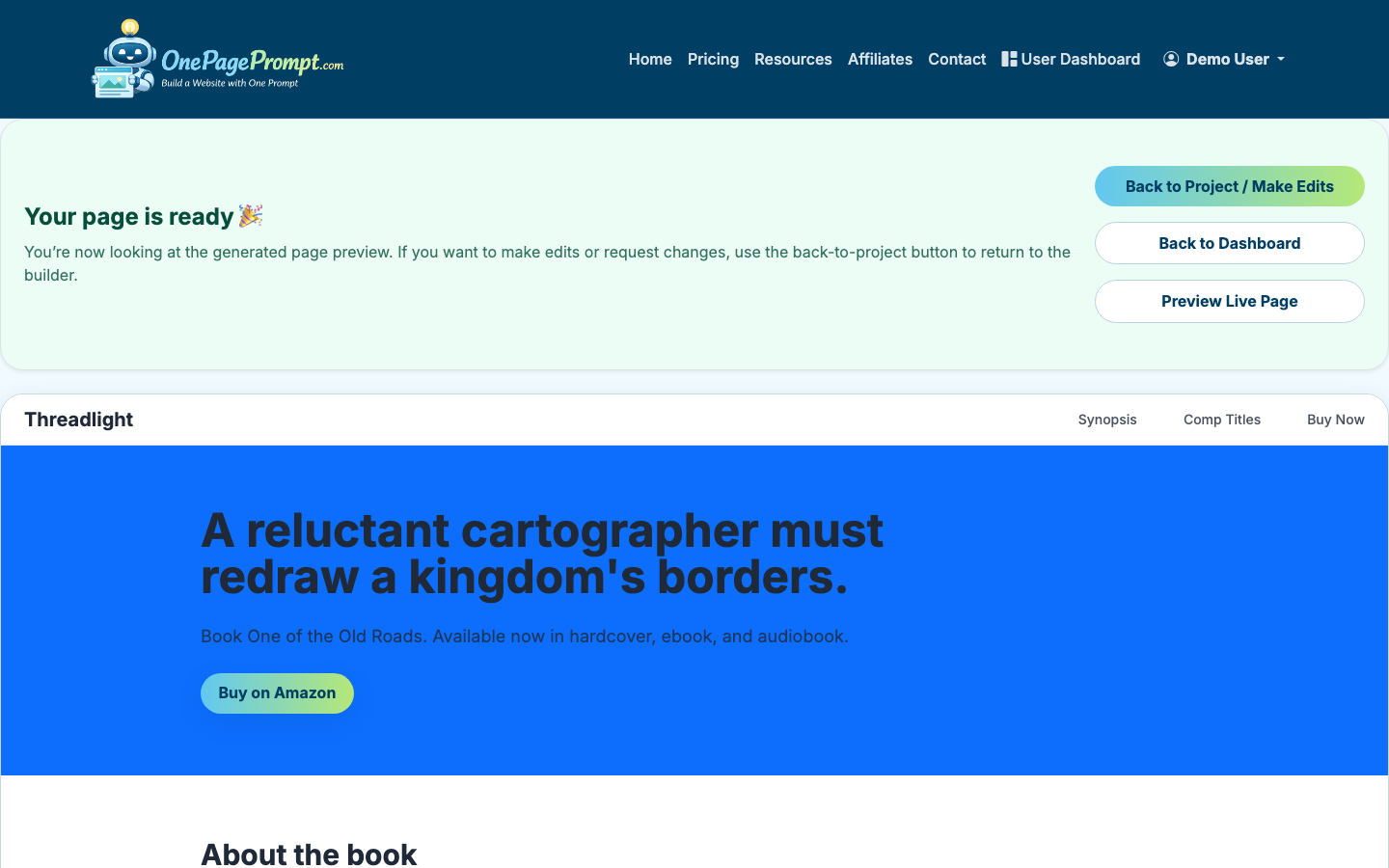
Check for:
- Repeated claims that could be combined
- CTAs that use different wording for the same action
- Long paragraphs that should be broken into bullets
- Missing details about price, timing, delivery, or next steps
- Sections that look good but do not help the sale
On mobile, pay special attention to the hero, CTA buttons, pricing, and FAQ. Many visitors will see your page on a phone first.
7. Publish and share the sales page
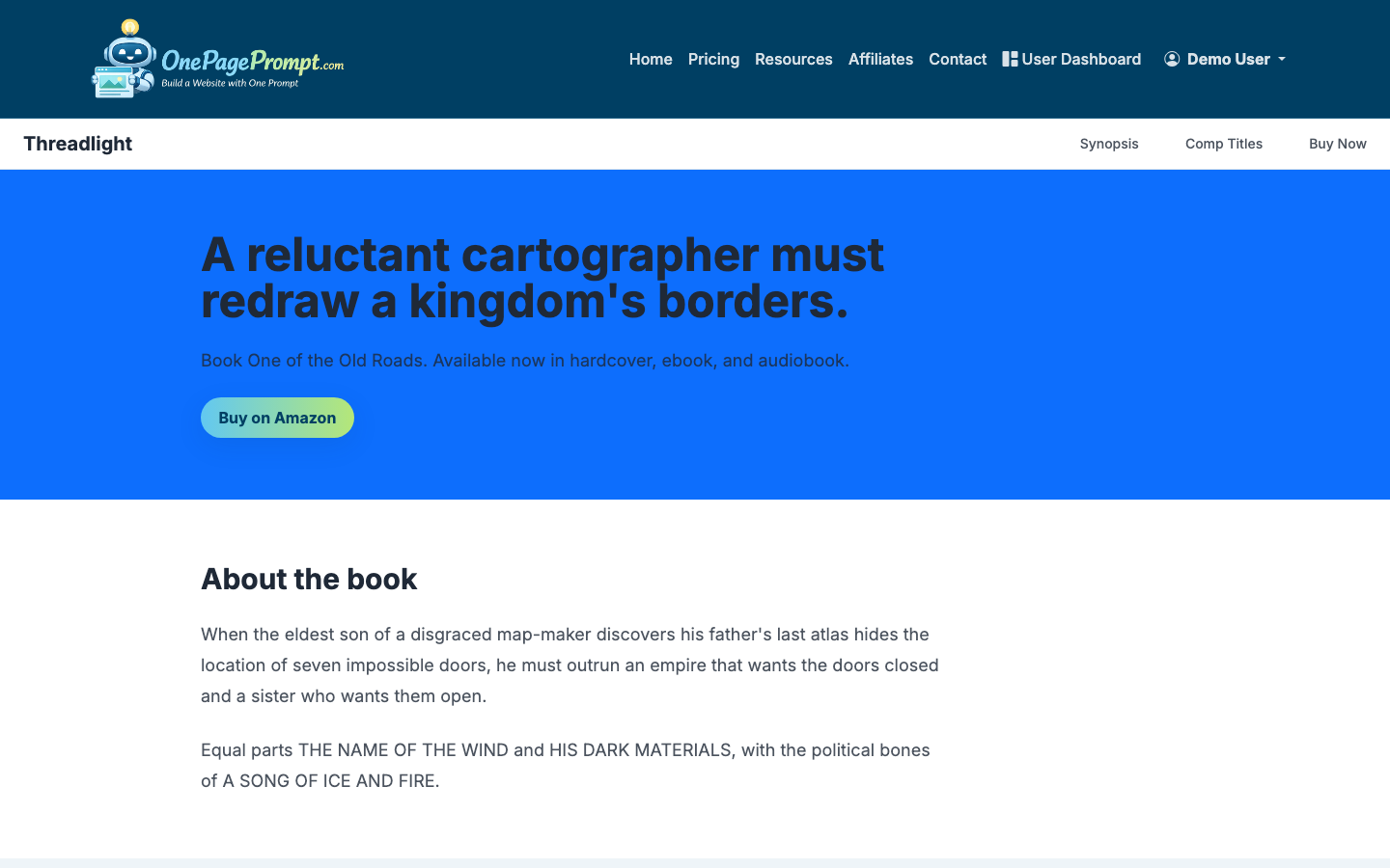
When the page is ready, publish it to your public OnePagePrompt share URL. Your page will be available at a public path like /p/<id>/<slug>, so customers or clients can view it without logging in.
Paid plans can connect a custom domain using CNAME-based DNS verification. That is useful if the sales page will be part of a serious campaign, paid ads, a book launch, or a long-running offer.
If you are testing a new offer, start with the share URL and send it to a small group first. Ask them what they think the offer is, who it is for, and what they would do next. If their answers are inconsistent, edit the page before sending more traffic.
How to build a sales page that keeps improving
The first version of a sales page is rarely the best version. After publishing, improve it based on real behavior and real questions.
Look for patterns:
- If people ask what is included, make the offer section clearer.
- If they ask whether it is for them, sharpen the audience language.
- If they hesitate on price, add proof, outcomes, or a better explanation of value.
- If they click but do not buy or book, check the checkout, calendar, or form experience.
For simpler opt-in pages, read how to create a lead page. If budget is your main constraint, how to create a landing page for free explains what you can launch without paying upfront.
A strong sales page is not a pile of persuasive tricks. It is a clear argument for a specific offer, supported by proof, arranged in the order a real buyer needs it.
For more on persuasive copy, see how to write website copy that actually converts.