What a Waitlist Landing Page Needs
A good waitlist page is shorter than most founders expect. The visitor should understand four things within the first 10 seconds:
- What you are building
- Who it is for
- Why it is worth joining early
- What happens after they join
Most waitlist pages fail because they try to sound impressive instead of useful. Avoid vague lines like “the future of productivity” or “a better way to work.” Say what the thing does, who gets value, and what joining the waitlist gives them.
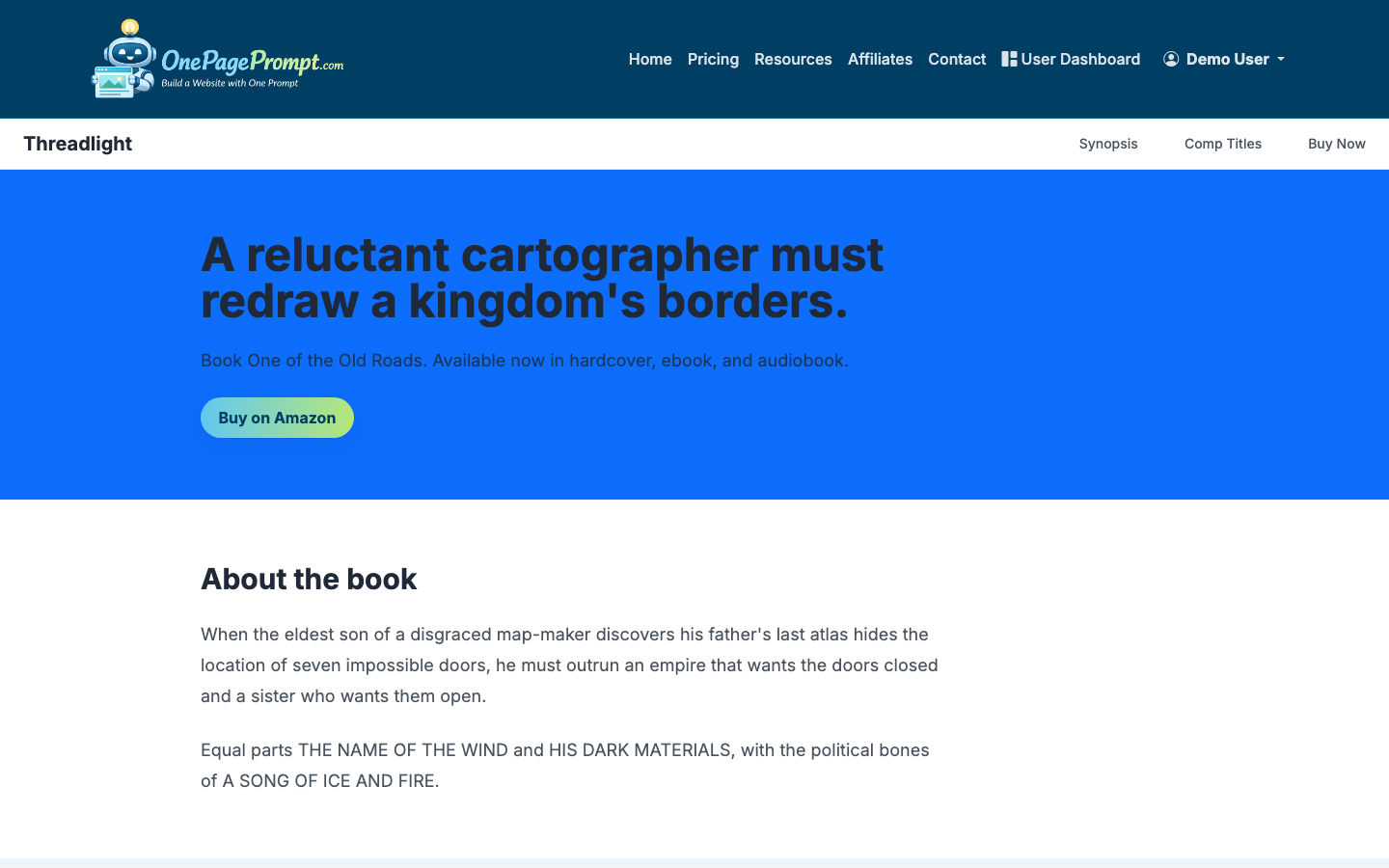
1. Start a New One-Page Project
Open OnePagePrompt and create a new project. Give it a working title that matches the thing you are launching. This title is mainly for your dashboard, so keep it practical: “Beta waitlist for invoice app” is better than “Launch page v3.”
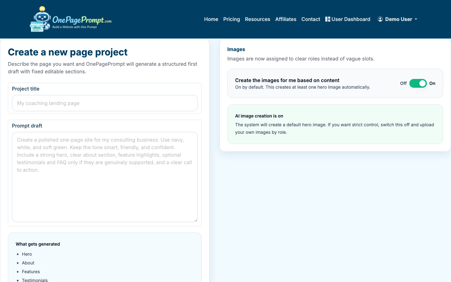
In the page description field, describe the waitlist page in plain English. Include the audience, the promise, and any proof or incentive you already have.
For example:
- “Create a waitlist landing page for a meal-planning app for busy parents. The page should explain that users can get weekly meal plans in under 5 minutes, invite them to join the beta, and mention that the first 100 people get free access for 3 months.”
- “Build a waitlist page for a newsletter about practical AI workflows for solo consultants. The page should feel concise, professional, and useful. Include a signup section and short FAQ.”
You do not need perfect copy at this stage. The goal is to give the AI enough direction to generate a strong first version.
2. Use a Focused Waitlist Page Structure
A waitlist page usually works best with five sections:
- Hero section with the main promise and signup call to action
- Problem section showing the pain your audience recognizes
- Benefit section explaining what changes when they use your product
- Early-access incentive or credibility section
- FAQ or expectation-setting section
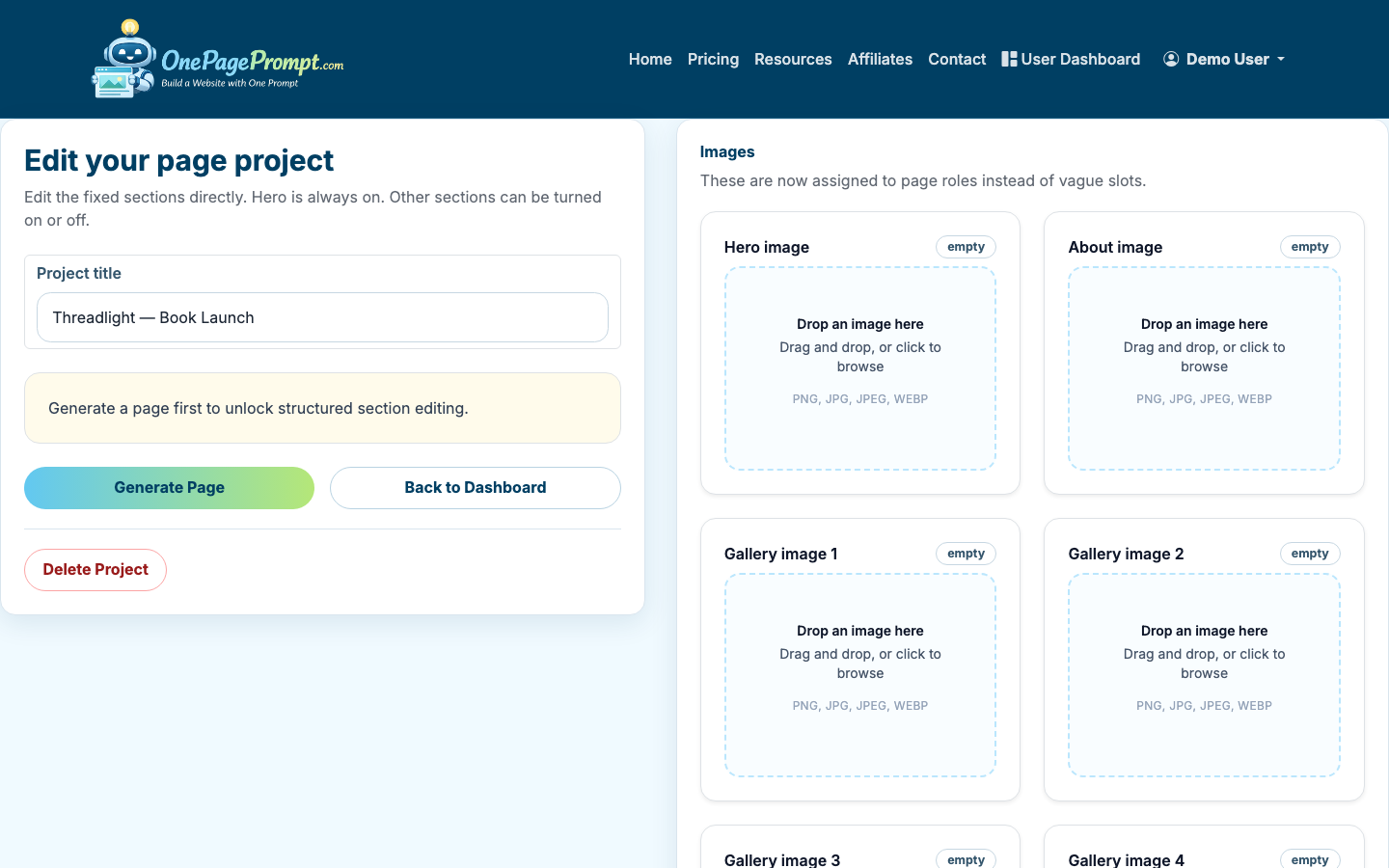
OnePagePrompt generates a structured one-page site from your description, then lets you edit the sections afterward. If the first draft includes extra sections you do not need, you can turn them off instead of regenerating the whole page.
3. Write the Hero Around One Clear Promise
The hero section is where most of the conversion work happens. It should answer: “Why should I give you my email?”
A strong waitlist hero usually includes:
- A specific headline
- One supporting sentence
- A direct call to action
- Optional incentive or timing detail
Weak headline: “A smarter platform for modern teams”
Better headline: “Plan your team’s weekly content calendar in 10 minutes”
Supporting copy can explain the product status: “Join the private beta for a lightweight planning tool built for solo marketers and small teams.”
For the call to action, use plain language. “Join the waitlist,” “Get early access,” or “Request beta access” all work. Avoid clever button copy if it makes the action less obvious.
4. Add a Signup Section With Minimal Friction
The signup form should ask for the least information you need right now. For most waitlists, email is enough. If you need segmentation, add one extra field such as company size, role, or use case, but be careful. Every extra field lowers completion rates.
A simple waitlist form might collect:
- Email address
- Name, optional
- One qualifying question, only if it changes how you follow up
If your waitlist is for sales-led software, you may need work email and company name. If you are validating demand, ask for less and optimize for volume.
5. Edit the Generated Copy and Colors
After generation, review each section in the project editor. Tighten sentences, remove generic claims, and make the page sound like your offer rather than a template.
Pay special attention to these areas:
- Replace broad benefits with specific outcomes
- Remove claims you cannot support yet
- Keep paragraphs to 1–3 short sentences
- Use bullets where people need to scan
- Make the CTA consistent across the page
You can also adjust colors in the editor. For a waitlist page, clarity matters more than decoration. Use enough contrast for buttons and form fields, and keep the palette simple. If you already have a brand color, use it for the primary CTA and keep the rest restrained.
If you are still shaping the broader page strategy, read how to create a landing page. If your main goal is capturing contact information, how to create a lead page covers adjacent lead-generation choices.
6. Preview the Page Before Publishing
Use the preview page to read the waitlist page like a visitor. Do not only check whether it looks good. Check whether the next action is obvious.
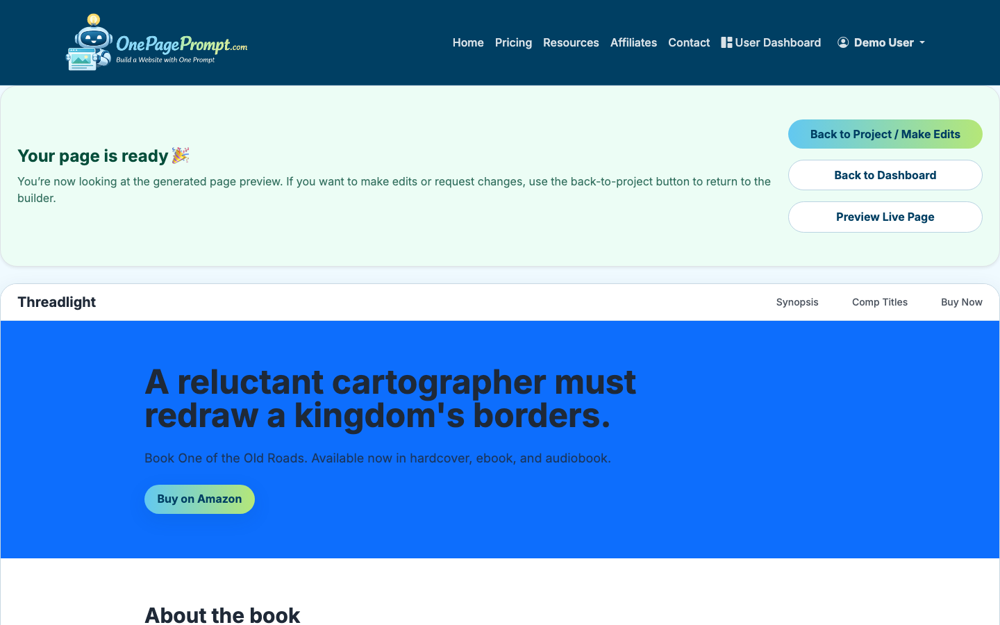
Before publishing, ask:
- Can someone understand the offer without scrolling?
- Is the audience clear?
- Is the signup action visible early?
- Does the page explain what happens after joining?
- Is there any section that repeats the same idea?
Preview on both desktop and mobile if possible. Many waitlist signups come from social links, newsletters, and communities where mobile traffic is common.
7. Publish and Share the Waitlist URL
Once the page is ready, publish it and use the public share URL when promoting the waitlist. OnePagePrompt pages are available at a public /p/<id>/<slug> URL, so you can share the page without setting up hosting first.
If you are on a paid plan and want the page on your own domain, connect a custom domain using CNAME-based DNS verification. That is useful if you are running paid ads, pitching partners, or want the waitlist to feel like part of an existing brand.
8. Send Traffic and Learn From the Response
A waitlist landing page is only useful if you put it in front of the right people. Share it in places where your target audience already spends attention:
- Founder communities
- LinkedIn posts
- Email newsletters
- Product communities
- Paid search or social tests
- Existing customer lists
Track the basic numbers: visits, signup rate, and source quality. As a rough benchmark, a cold traffic waitlist page might convert 5–15% of visitors. A warm audience can convert much higher, especially if the offer solves a painful problem.
If you are testing the idea before spending money, you can also compare options in how to create a landing page for free.
Common Waitlist Page Mistakes
The biggest mistake is writing for everyone. A waitlist page should make the right visitor feel recognized, even if that means other visitors bounce.
Other common issues include:
- Asking for too much information too soon
- Hiding the signup form below too many sections
- Using vague benefit copy
- Launching without a follow-up plan
- Offering early access without saying what “early” means
A waitlist page is not the final version of your product story. It is a focused test: can you explain the offer clearly enough that the right people ask to hear more?
If you'd rather skip the design work, see how to build a landing page in 2 minutes without writing code.